
Guidelines
Colors, typography, elements, photography and ready-made recipes for social, web and print.
V1.1
V1.1

Primary: R'EDORANGE box on light backgrounds.
Inverse: white wordmark on dark backgrounds.

The A icon can be used on its own, with or without the main logo. Variants: All In One, All Black.
Small logo in the corner of social visuals (top left or top right, roughly 6% margin). Let it act as a quiet signature. The logo can share the layout with a large product name.
One logo per surface. No repetition, no watermarks, no stretching, no drop shadows.
Don't recolor the logo. Only the two approved versions exist: R'EDORANGE box with white text, and white box with black text.
Keep clear space around the logo: at least the height of the letter R on every side.
R'EDORANGE is always #E94E1B, the same value the website uses. Older files may contain #CC4B1D or #CD4F2A: replace them with #E94E1B when you touch those assets. For print, convert from #E94E1B (CMYK approximately 0,80,95,0).
Body text uses Acumin Pro ExtraCondensed. Short, punchy sentences. One idea at a time, facts first.
Keep it simple and modern. Empty space is the strongest tool in the RAULI look: three pages or three slides beat one crowded layout every time. Images speak, text condenses.
Every slide, page or post carries one main message. The rest moves to the next surface.
Header, subline and one optional highlight. No data dumps: a couple of figures at most.
Content breathes: at least 8-10% from the edges in social visuals, clear gaps between elements.
Short R'EDORANGE line (about 60 x 4 px). Always short, always max one per surface. A long thin line does not work. Leave clear space between the line and the text.
Bebas uppercase in an orange box. Only for special cases and section openers, not for every header.
The 1-2 most important words of a header can be in R'EDORANGE. The most effective way to bring color in without extra elements.


Main icons are simple and thin with roundness in them; they soften the strong typography. Ready-made SVG and Lottie versions exist for EasyClick, EasySlide, Telescopic, Made in Finland and the 30-year warranty. Use them instead of drawing new ones.
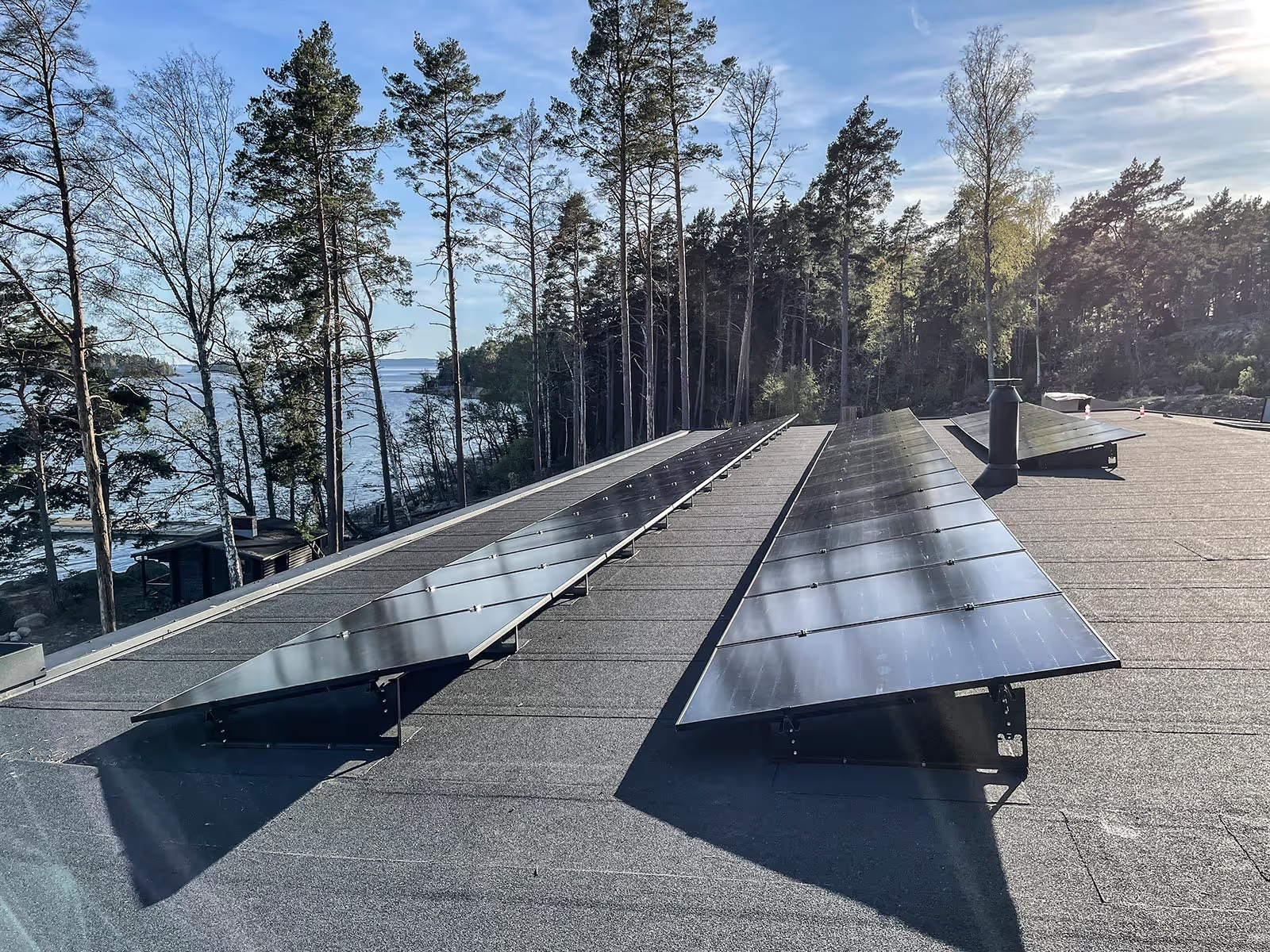
Natural. References, installations, people and buildings: daylight, real situations, no heavy processing.
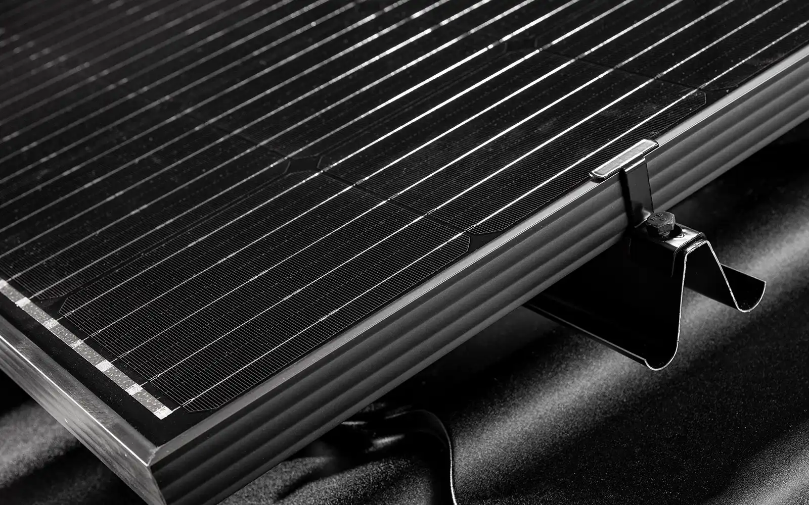
Product shots on dark backgrounds, directed dramatic light, clean surfaces. Premium without gloss.
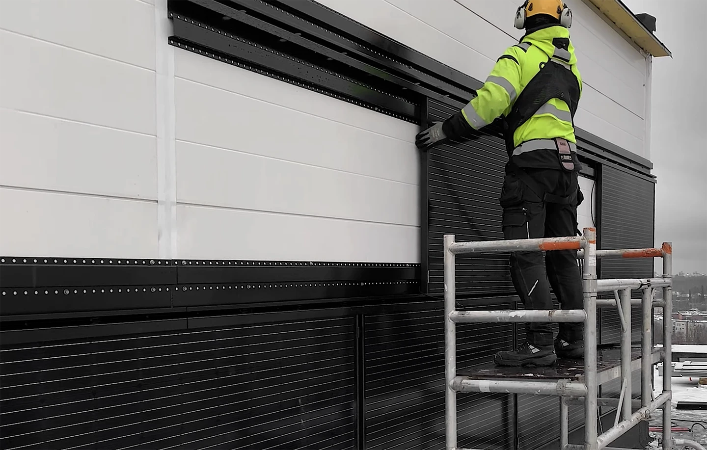
Real photos from real sites: installers at work, tools, weather, drone views. Credibility beats polish.
Primary: R'EDORANGE background, white text, 4 px corner radius, 12 x 40 px padding, Acumin 19 px. Secondary: transparent with a thin light border. On this site: classes "submit-button" and "button".
H1/H2: bebas-neue-pro 600, uppercase, 6rem / line height 0.9. H3: 3rem. Body: acumin-pro-extra-condensed 400, 1.2rem. Dark backgrounds: #0F0F0F and #1D1D1D. Light text tone on dark: warm white #EBE8E7.
Layout/container-max 1440px · Layout/container-pad 40px · Layout/section-pad-y 8vw · Border/width 1px · Accent line 60 × 4px. Content sits in a 1440px max-width container with 40px side padding, exactly like the rest of the site.
Four recurring templates cover almost everything. Every post works on its own, the language is English, and every slide follows the rule: one idea, max 3 text elements, one accent.
Dark product photo as background, big Bebas claim, 1-2 words in orange, short accent line, subline. For hero use and carousel openers.
Product names in Bebas uppercase, descriptive subline, orange line as separator.
Reference photo as background, short quote in Bebas, name and place as the subline.
Light Clean & Bright base, one figure or claim, fact-based subline. For technical highlights and carousel inner slides.
Feed post 1:1 (1080x1080) or 4:5 (1080x1350), story 9:16 (1080x1920). Carousel: open with a statement slide, 3-5 inner slides, close with a CTA and the logo. Story safe zone: keep 250 px clear at the top and bottom.
A campaign layer on top of the design system: same typography, same logo, same rules, but the base message is that we are KING OF THE NORTH. Cold and toughness comes from photography and texture (snow, frost, low winter sun), never from color. The claim is earned with facts: SSAB steel, storm tested, Nordic snow loads, 30-year warranty etc.
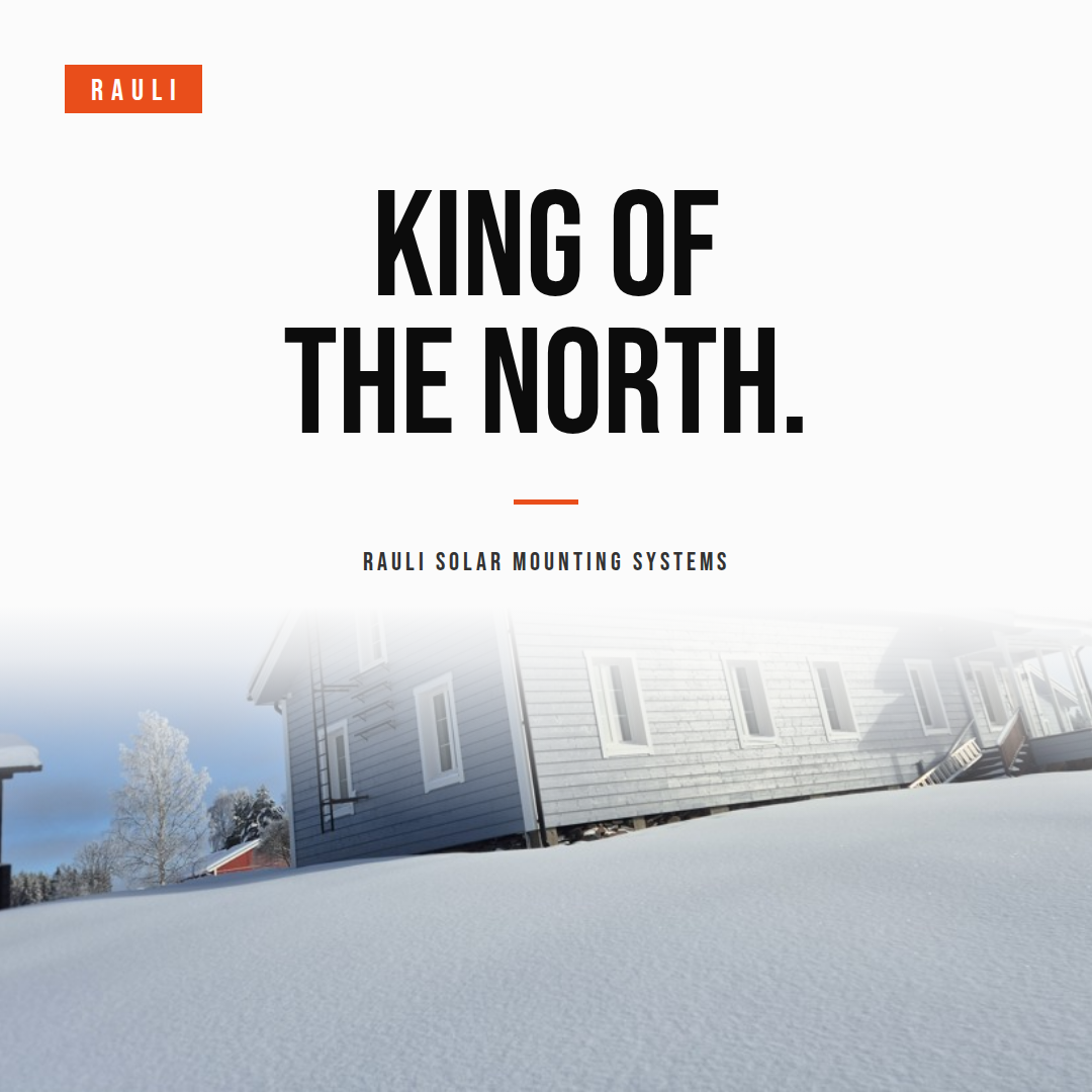
1. Statement. White base, snow photo fading in at the bottom or top, black headline.
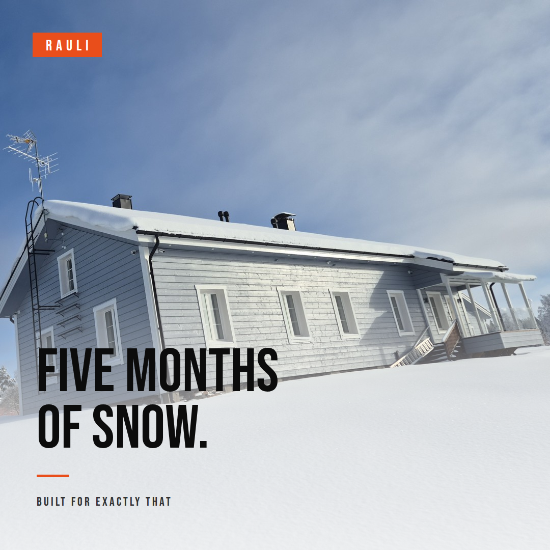
2. Winter photo. Full-bleed winter shot, black text on clean snow over a soft white scrim.
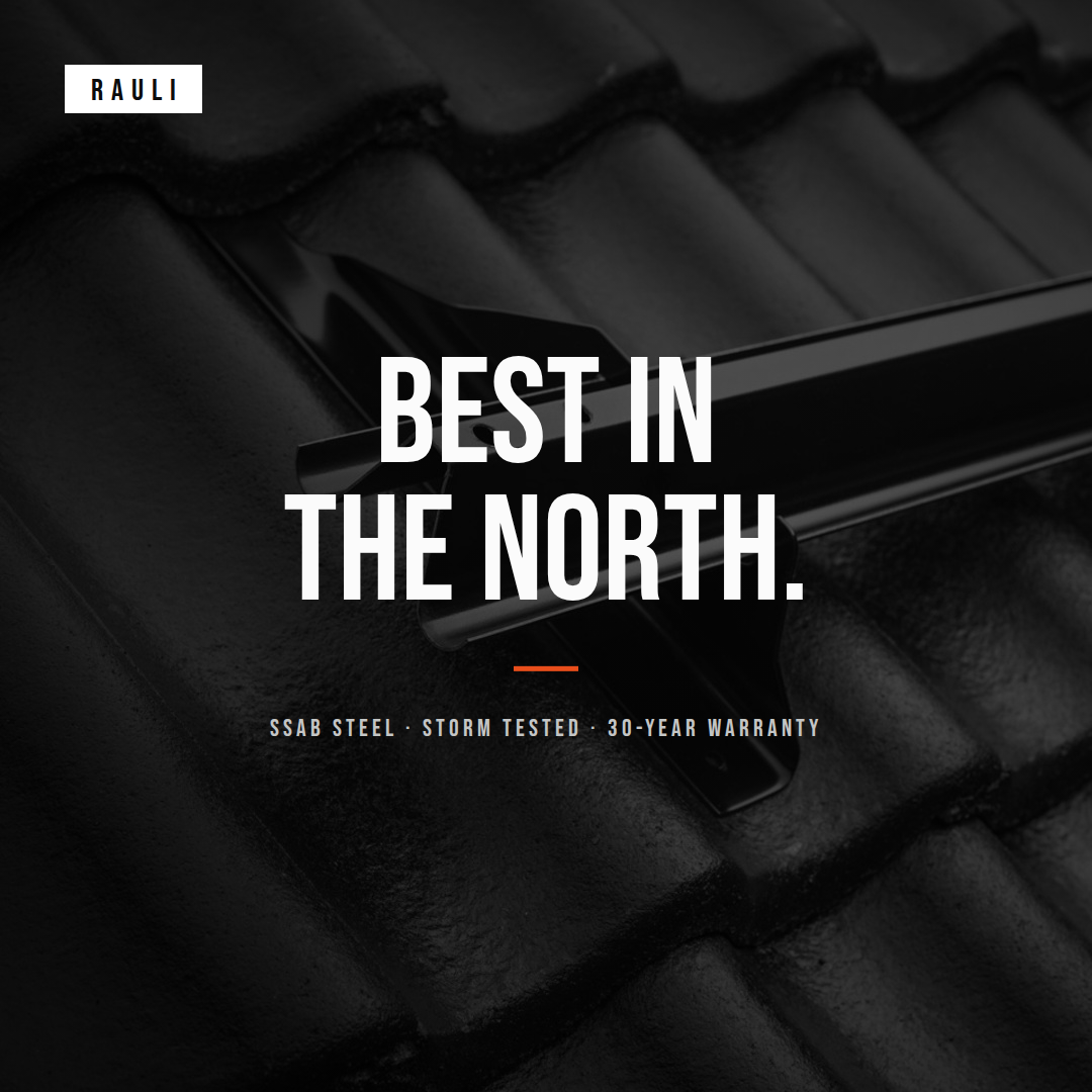
3. Dark product. For product-focused KOTN posts: dark photo, white headline.
Single-color headlines only: black on light, white on dark. Orange appears only in the logo chip and the short accent line, as the one warm point in the cold.
King means being the best, king of the hill. Working lines: "King of the North.", "Best in the North.", "Built for exactly that."
No ice blue or any new campaign color in graphics. Cold lives in the photos, the palette stays black, white and R'EDORANGE.
No crowns and no royalty wordplay. And on photo backgrounds, text goes on clean snow or over a scrim: readability first.
One idea per slide. Less data, more space. Let the images speak.
Fact-based superlatives. "The most elegant flat roof system on the market" works when the claim holds: 30-year warranty, tested strength, SSAB steel.
Use the slogan: "Trusted by professionals, chosen by installers." or "King of the north".
In Finnish copy: FLAT brackets are "paistetaan" into the bitumen membrane, never "poltetaan".
No long thin lines. The accent line is always short (~60 px) and there is at most one.
No em dashes and no AI cliches in any copy. Keep technical facts straight: heat welding belongs to FLAT and BLACK bitumen installs, WALL mounts with EasySlide.
KING OF THE NORTH. Trusted by professionals, chosen by installers.
Quick to install · made in Finland · 30-year warranty · SSAB Nordic high-strength steel · Designed by installers · Built for northern conditions
Short, punchy sentences. One idea at a time. No long explanations, no nested clauses.
BLACK (pitched roofs) · FLAT (flat roofs) · WALL (facades) · TAILOR-MADE · RAULI APP · NOVA (pitched roofs, Central Europe, 25-year warranty)
EasyClick · EasySlide · Telescopic · Double Safety. Always written exactly like this.
Certifications held: CE · ISO 9001 · ISO 14001 · EPD · EMI · TÜV SÜD (PV mounting). Warranty: 30 years, 25 years on NOVA. Steel: SSAB Nordic high-strength steel, corrosion class C3.
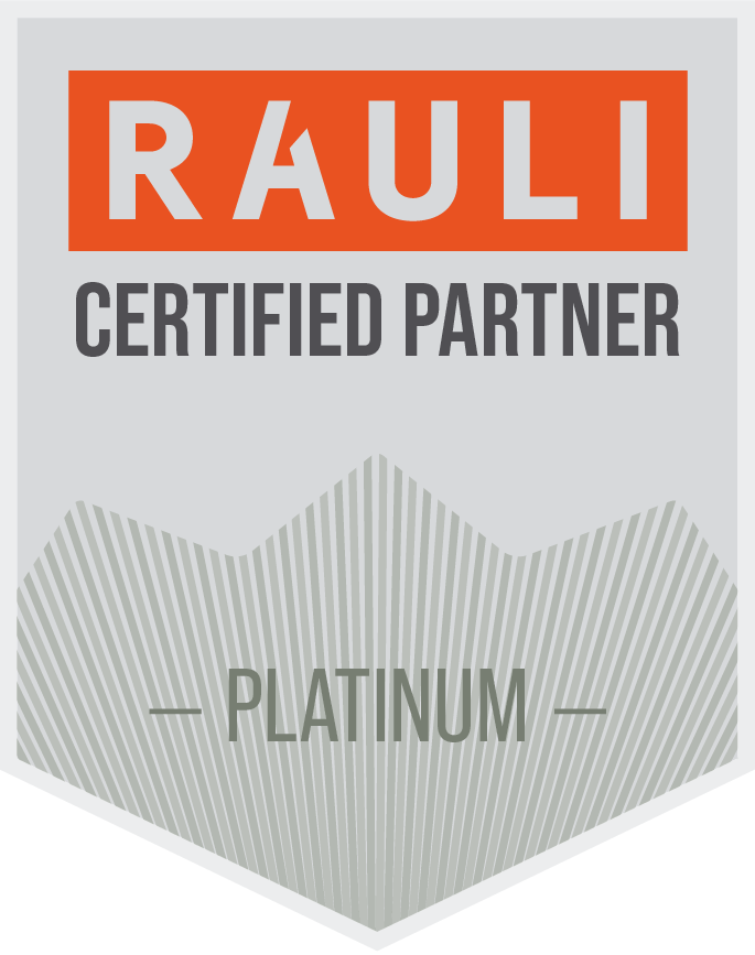
Four partner tiers, each with its own metal color and badge. Use the official badge; the tier color belongs to the badge only, not to general layouts.


These are the site's existing Webflow variables (Base collection). Use them for everything on the site; use the same values outside Webflow.




.png)
All RAULI products are designed for durability and consistent performance over time.
© Rauli Solutions - All rights reserved
